An assessment of machine learning methods to quantify blood lactate from neutrophils phagocytic activity

Experimental setup and data collection
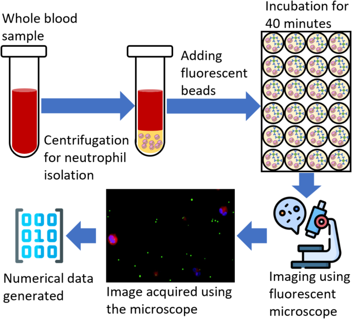
This study follows the experimental setup and data collection protocol discussed in the previous study26. Blood samples were collected from the Robert Wood Johnson Hospital under IRB (IRB application # Pro2018002356) for 19 patients to study the human neutrophils’ phagocytic activity and their relation with blood lactate levels. Out of 19 patients, eight were clinically diagnosed with lactate levels lower than two mmolL− 1, while the rest had higher than 2 mmolL− 1. The data collection and preprocessing were completed in three steps. During the first step, the neutrophils were isolated from the whole blood sample by following a standard cell isolation protocol. The whole blood mixed with 1x phosphate-buffered saline (PBS) was layered over a density gradient in centrifuge tubes. After centrifugation, the polymorphonuclear leukocytes (PMNL), erythrocytes, and red blood cells formed a dense layer at the bottom of the micro-tubes. The top layers above the erythrocytes were removed, and the red blood cells were lysed. The remaining leukocytes were pelleted and washed with PBS. To improve the purity, erythrocytes were lysed, and the isolated PMNL were suspended in the RPMI 1640 medium and counted. As observed, the isolation process resulted in high purity and the capture efficiency of neutrophils up to 95%.
In the second step, the neutrophils were added to a 24-well plate at a concentration of 6 × 10⁵ cells per well. Each patient’s blood sample was tested in triplicate to improve the test accuracy. Fluorescent beads tagged with human IgG antibodies that resemble common bacteria in size were added to the wells at a ratio of 1:25. A cell membrane dye was added to visualize the cell surface. The solution was incubated for 40 min at 37◦C to facilitate phagocytosis. After incubation, the remaining beads were removed and washed with chilled PBS, and a nucleic acid stain was added. The solution was kept on ice for 10 min and washed with PBS. The media was imaged using a fluorescent microscope, and four images were collected for bright field, blue nucleic acid stain, orange cytoplasmic stain, and green antibody stain. These images were combined by adding, and a single image was generated.
Finally, an open-source image processing software, ImageJ27 was used to quantify the phagocytic activity. A total of 15 images were analyzed for each experiment, each well contributing five images. Initially, the regions fluorescing orange cytoplasmic membrane dye and blue nucleic stain dye were identified. These regions correspond to the number of cells and beads inside the areas of interest, which were counted as the internalized particles. The total number of internalized particles was also calculated for each cell. Following this protocol, a numerical dataset was generated for each patient. The dataset consists of ten features and 19 examples of phagocytosis activity26. Features include the “average and standard deviation” of beads internalized by the cells and the counts of cells with “zero to seven” beads internalized, resulting in 10 features. The dataset was then normalized by subtracting the minimum feature value and dividing it by the difference between maximum and minimum feature values. Finally, the dataset was split into two groups: a control group (low lactate levels) and a high-risk group (high lactate levels). The resulting group variable was used as the target variable for binary classification. Figure 1 shows the flow chart of the experimental data collection and processing procedure.
Outlier detection and removal with isolation forest
As stated in the previous study26 the machine learning algorithms performed poorly when trained on the collected dataset. One of the primary reasons for the poor performance of the algorithms can be attributed to anomalies in the dataset. To improve the detection and classification ability of the machine learning algorithms an outlier detection and removal algorithm based on the ensemble of isolation trees28 has been employed. An anomaly score is calculated for each observation based on the average path lengths over all the isolation trees, as shown in Eq. 1.
$$\:s\left(x\right)=\:h\right(x\left)\right^{\frac{c\left(n\right)}}$$
(1)
Where s(x) is the anomaly score of an observation x, h(x) is the path length in a tree, E|h(x)| is the average path length over all isolation trees, and c(n) is the average path length of unsuccessful searches in a binary tree of n observations. The contamination factor 0.05 was used as it assumes that approximately 5% of the data is corrupted or contains outliers. Also, the size of the original dataset was small. A conservative approach was used as a higher contamination factor, which might consider normal points to be anomalies and reduce the size of the dataset significantly. Moreover, the chosen value aligns with typical anomaly expectations in real-world scenarios. Each subgroup in the collected dataset was trained using this technique, and the anomalies were removed. Finally, the pruned data groups were concatenated and used in the training and evaluation of an ensemble of bagged trees, an ensemble of k-NN, and Naïve Bayes classification algorithms.
Ensemble of bagged decision trees
In this study, a bagged decision tree and random forest-based ensemble learning technique have been employed. A total of 30 bootstrap replicas were generated for the training data with the replacement of the selected sample. A decision tree was trained on each bootstrapped dataset with a random forest technique that allowed each learner to choose the predictors randomly. The classifier learner app in MATLAB was used to generate the code for bagged decision trees with ensemble learning.
Ensemble k-nearest neighbor
K-nearest neighbor classifiers with random subspace ensembles have been employed to classify the data into control and high-risk groups. The k-NN is a non-parametric supervised learning algorithm, and the Euclidean distance metric was used to calculate the distance between neighbors. The random subspace ensemble technique in this study selects a random set of features from the training dataset and trains a k-NN model. The k-NN model was trained with k being set to 5 neighbors. Since the dataset size is small, using too few neighbors could lead to prediction instability. At the same time, a bigger value of k can ignore the influence of local patterns in the dataset. Selecting k = 5 provided a balance between ensuring that the model can learn local patterns while avoiding overfitting. The method predicts the final score of the class by taking the average of all the trained classifiers, with the class having the highest average score.
Naïve bayes classifier
The Naïve Bayes classifier is a statistical machine learning algorithm that leverages the Bayes theorem and makes predictions about the class of the observations based on the conditional probabilities of features given the class labels. The algorithm first estimates the likelihood of the features given a class label for the entire dataset. Then, based on the likelihood and priors, the occurrence of the class variable is estimated based on the observation. In this study, a Naïve Bayes classifier has been trained on the collected data and kernel normalization on the input feature vectors. The kernel normalization assumes a probability distribution on the input feature and normalizes the feature vector. Normal distribution was assumed to fit each feature vector, and the corresponding normalization was applied. A normality test was performed on 8 features, where the eighth feature provides information regarding the 5 or more number particles engulfed. Since the last two features contain spare data, they have been added to the 8th feature. The Kolmogorov-Smirnov method was used, and the p-value was acquired. A significance level of 0.05 was used, and all the features reported a p-value > 0.25, indicating that the features follow a normal distribution.
Clustergram
A clustergram combines heatmaps and dendrograms to visualize the similarities or dissimilarities between the variables in the dataset. Each value/color in the cell corresponds to the normalized value of that feature for a particular sample. Dark red indicates the high value, white indicates the average value, and dark blue indicates the lowest value. A hierarchical clustering technique groups the items together based on distance or similarity indices. This study uses the correlation distance as the dissimilarity metric. The correlation distance is calculated as shown in Eq. 2, and the similarity/dissimilarity matrix is generated.
$$\:{d}_{c}=1-{r}_{xy}$$
(2)
Here, dc is the correlation distance, while \(\:{r}_{xy}\)Is the sample correlation and is calculated as:
$$\:{r}_{xy}=\:\frac{{(x-\stackrel{-}{x})(y-\stackrel{-}{y})}^{{\prime\:}}}{\sqrt{{(x-\stackrel{-}{x})(x-\stackrel{-}{x})}^{{\prime\:}}}\sqrt{{(y-\stackrel{-}{y})(y-\stackrel{-}{y})}^{{\prime\:}}}}$$
(3)
The correlation distance quantifies the dissimilarity between two variables or datasets. The higher values of correlation distance suggest that the variables are dissimilar, as the correlation coefficient between the variables will be lower. The lower values of the correlation distance are related to the higher similarity between the variables, as the correlation coefficient will be higher.
Agglomerative hierarchical clustering
Agglomerative clustering is a type of hierarchical clustering technique in unsupervised machine learning. The algorithm follows a bottom-up approach where it considers each data point as the cluster or singleton cluster, calculates the distance between the clusters, and merges the clusters that are closer to each other in distance. This study employs the Euclidean distance as the distance metric and aggregates the clusters based on the average distance method. First, the distance between each point in the two clusters is calculated using the distance metric. Then, the final distance between clusters is calculated using the distance method, e.g., Average, Centroid, Ward, etc. The clusters are merged based on the threshold set on the average distance. The process is repeated until all the clusters are merged into a single cluster. Starting from the bottom with singleton clusters, the algorithm generates a tree-like structure at each iteration until convergence is reached with the parent node or cluster. Each level of the created dendrogram/tree provides the number of clusters that can be formed based on the distance or similarity index between the variables. Once a dendrogram is generated, it can be used in machine learning or statistical analysis to draw conclusions from the results and analyze the dataset.
Training procedure and environment
The dataset prepared using the procedure discussed in the experimental and data collection section was then used by the outlier detection algorithm, which resulted in a new dataset. To make fair comparisons between the performance of selected algorithms and the effects of data pruning, all the models were trained on both original and pruned data. As the number of training examples is low and models are susceptible to overfitting, a 5-fold cross-validation technique has been employed to estimate the robustness of all selected machine learning models and reduce the chances of overfitting. Moreover, an ensemble learning technique was used to optimize the performance metrics. A hundred different versions of the training data were generated by randomly shuffling the data. All the models were trained on the 100 generated datasets, resulting in 100 different trained models for each type of machine-learning technique. The accuracies of these models were used to estimate the overall accuracy of the classification. All the models were trained in a system (Core i9, 10th Gen, 32GB RAM) with MATLAB as the development environment.

The clustergram plots were generated using heatmaps and dendrograms. (A) The clustergram of the Control group. (B) The clustergram of the High-risk group.
link


